Rob just peered over my shoulder and he said, “I like your old design better.”
“Whaaa?”
“It’s a little easier to read but the title is hard to see”
“What color should I make it?”
“Make it look like you had it before”
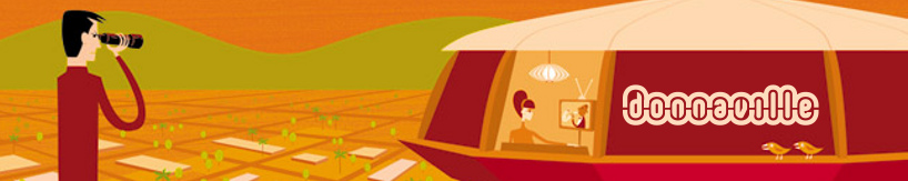
donnaville
sugar and spice and everything groovy
I’m with your dad on this; this new design you’re experimenting with is much easier to read, though not nearly as edgy.
Surely there’s a happy medium between style and readability.
I agree with Rob.
I’m not jumping on the band-wagon here, either. I believe I told you before that I liked the retro-sensibility of the prior design. The dingbats up top were fun and reflected your interests. Maybe exploring a different color-scheme of the prior design will enhance the readability for your dad, and still maintain the fun quality of your blog? I know you are in a transition phase, but the current look may be too plain for your tastes ( I think … )
Hey, it’s YOUR blog, so make it something YOU are happy with. You’re your own client on this one …
Just a thought, and have fun!
N.
Check out this blog design:
http://www.afrobella.com/
It’s a good compromise between form and function.
http://www.afrobella.com/ = ugly
I agree with Rob! The old design was you!